User Guide

General

On the website's homepage, you will see two main buttons. The play button (  ) will take you to the poverty map video profile, while the menu icon (  ) on the top right-hand corner of the webpage will open a navigation bar on the left-hand side of the page. The navigation bar has five main menus:

  • Home: link to the website's homepage.
  • Map: link to the poverty map page. Instructions on using the map will be explained in detail below.
  • User Guide: a written tutorial on how to use the poverty and livelihood map website. Clicking the small arrow next to the User Guide will show a drop down menu containing About the Map, Methodology, Video Tutorials, and Related Sites.
    • About the Map: a detailed explanation about SMERU's poverty map.
    • Methodology: provides casual technical information about the creation of the poverty map
    • Video Tutorials: links to video tutorials on how to use the website in general, how to use the poverty map, and how to choose livelihood indicators on the map.
    • Related Sites: links to the websites related to the poverty map.
  • Reports: provides supporting documents related to the poverty map.
  • Contact Us: features that enable the user to give feedback and suggestions to the poverty map team.

Explanations about the background of the Poverty and Livelihood Map of Indonesia 2015 can be accessed through this video, which you can also access from the homepage by clicking the Play button. You can also read the explanation in About the Map or in our brochure.

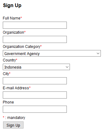
If you are accessing the website for the first time, clicking the Map menu will automatically take you to the registration page. Fill in your details under the sign up menu and click Sign Up. You are expected to fill in all the fields.


You only need to register once. If you are using a different computer, you just need to sign in using your registered email.


As soon as you have finished the registration process, you will be directed to the map. In the left column, you can see a menu used to filter information according to province and district, by sub-district or by village. Here, you have several options for what to view in the map:

  • Choose 'all provinces' in the province field and the level of analysis you need (e.g. province or district level). Click the Submit button. This option will show you the poverty map of Indonesia divided into provinces or districts.
  • Choose a province in the province field. Leave the district field on 'all districts' and choose the level of analysis you required (e.g. district or sub-district level). Click the Submit button. This option will show you a poverty map at the province level, divided by district or sub-district.
  • Choose a province and a district then click the Submit button. This option will automatically show you a poverty map of your chosen district calculated by village.


(Option 3 map's interface)


  • There is also an option to display information based on livelihood indicators. To show these indicators on the map, you can simply choose the indicators in the livelihood field and click the Submit button. There are five main groups of livelihood indicators (i.e. Natural Asset, Financial Asset, Physical Asset, Human Asset, and Social Asset). Each indicator has several options that you can choose from based on your needs.


  1. An image of the area based on the indicators you choose:
  • Move your cursor over an area on the map and the area name and poverty information will appear.
  • You can choose the poverty line (NPL or US$3.1 PPP) by clicking  on the map.
  • To save the image, you can right-click on the map, and choose "Save Image As…". You can only save the images in the png file format.
  1. Contents of the map legend:
  • The poverty range is dynamic and was calculated using a benchmark of the largest and the smallest estimated number at each level of the selected region. Please pay attention to the colors and poverty rate estimation for each area. You can only compare the poverty rate estimation and the color range within the same area, not between other areas in the other map.
  • An explanation of the poverty lines (NPL or US$3.1 PPP) can be found if you move your cursor over i in the upper side of the label.
  • The grey color indicates unselected areas while the blue color indicates the ocean.
  1. Above the image of the map, there are three tabs; namely Map, Table, and Description:
  • Map: shows the map of the areas, based on your chosen indicators.
  • Table: gives you the details of poverty estimate data, the headcount index (P0), poverty gap (P1), poverty severity index (P2), and Gini Index.  You can download the data by clicking the blue link at the top of the table "Export to csv" .
  • Description: describes qualitative information about the village. This information will only available for villages that have been used as research locations for SMERU's previous studies. Because of this limitation, we give you the opportunity to add information that is not yet provided.

If you need to use poverty data from the map, it has to be noted that the poverty rates in sub-district and village level are derived from an estimation model. The estimation of the poverty rates was created based on the 2010 Population Census, and 2010 and 2015 household surveys (using SUSENAS, the National Socioeconomic Survey). The data in this poverty map represents the condition of sub-districts in 2015 and villages in 2010. Other things you need to consider in interpreting the poverty estimates are:

  • Always pay attention to the standard error. Basically, the standard error indicates the range of estimation. With a certain level of confidence, the poverty estimates are within the range of estimated numbers plus/minus the standard error. You can find details of the standard error in the Table tab.
  • Standard error also simply indicates the accuracy level of the estimation. The smaller the standard error, the better the estimation.

The livelihood indicators were created using a variety of sources from different years of publication. Therefore, it is very important to understand the data characteristics before using them. Check the information of the data source and the publication year of each variable to make sure it provides the correct information based on what you require.


The key elements of the poverty and livelihood map 2015 website reference are:

  • The organisation who wrote or created the webpage.
  • The year the webpage was created or last updated.
  • The title of the webpage, followed by [online].
  • The full URL.
  • The day, month and year you accessed the website.

In-text Referencing

(Poverty and Livelihood Map of Indonesia 2010) 

Reference List Harvard Model

SMERU (2014) Poverty and Livelihood Map of Indonesia 2015 [online] <http://www.indonesiapovertymap.org/> [2 June 2017].